In this tutorial, I am going to show you how to make bar chart and pie chart using an OpenOffice Calc. The version of OpenOffice used in this tutorial is Apache OpenOffice 4.1.1.
Here is an example of a data (from my Tutorial 2) where Grades, Count and Percentage of the grade distribution of students in Chemistry are shown.
Note: All of the students names and scores which appeared herewith are only hypothetical and do not reflect their real performance in class. This is for description and visual purposes only.
To create a bar chart:
Step 1: Highlight the cells where the data is located. This data will be used for the bar chart.

Step 2: Click the chart symbol on top.
Step 3: Another tab will appear (Chart Wizard) which asks you to choose a chart type. Since we are creating a bar chart (with vertical bars), choose column, then click next.

Step 4: Next, you are asked to choose the data range. But in here, we will focus more on Data Series, which is in Number 3.
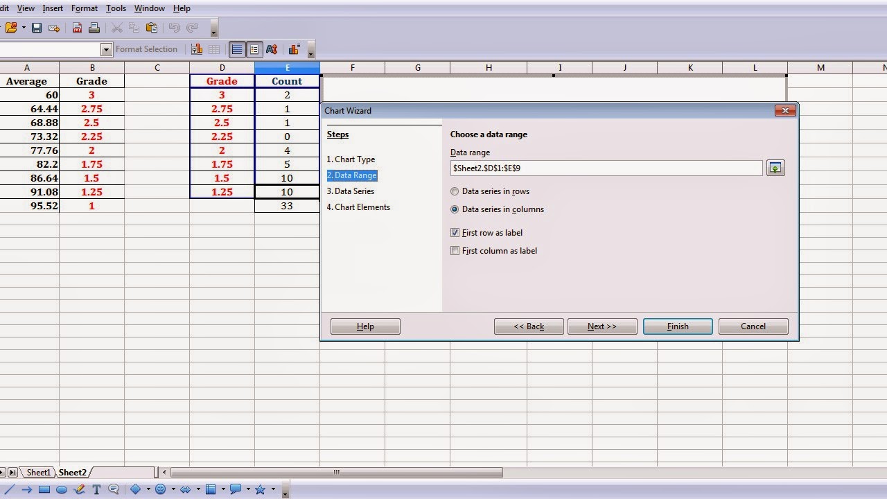
Step 5: Click on the Data Series. You are to customize the data ranges for individual data series.

Step 6: You now have Data Series, namely Grade and Count. Since we are to create a bar chart based on how many of the students got a particular grade, the data series 'grade' will be omitted. Click grade, then click Remove.

Step 7: We now have the Count on our Data Series. To designate for categories, click the Categories portion, and highlight cells under Count.

Step 8: Then click the Y-Values. To designate for the Categories, highlight the cells under Grade. Then, click Next.

Step 9: Next, will be the Chart Elements. Enter your desired Title, Subtitles, Legend for the x and y axes. Click Finish.

Step 10: A bar chart will appear showing the grade distribution and number of student (count) of a particular grade.

In your bar chart, you can create your pie chart with it.
To transform a bar chart into a pie chart:
Step 1: Click on the center of the vertical bars until small green squares will appear.

Step 2: Right click, then click on Chart Type.

Step 3: Choose on Pie, then click OK.
 Step 4: A pie chart showing the grade distributions of students in different colors will appear.

Congratulations! You now have a pie chart showing the grade distribution of your students in Chemistry.
What if you want to have a pie chart showing the percentage of grades? You can just edit the previous pie chart which you have created.
Step 1: Click on the center of the pie until small, green squares will appear.
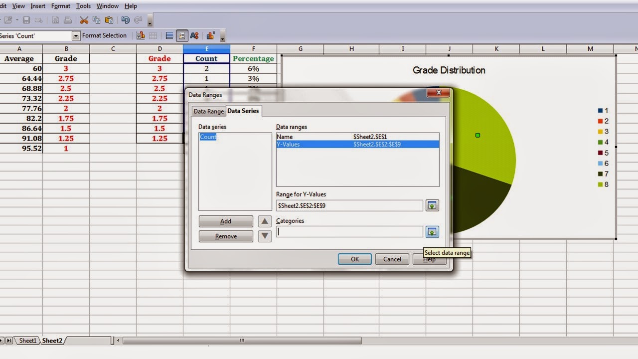
 Step 2: Right-click. Click on Data Ranges.
 Step 3: Another tab will appear (Data Ranges). It shows the Data Series, which is Count, and the Data Ranges. To designate Categories, highlight cells under Count.

Step 4: To designate Categories of the Y-values, highlight cells under Grade.
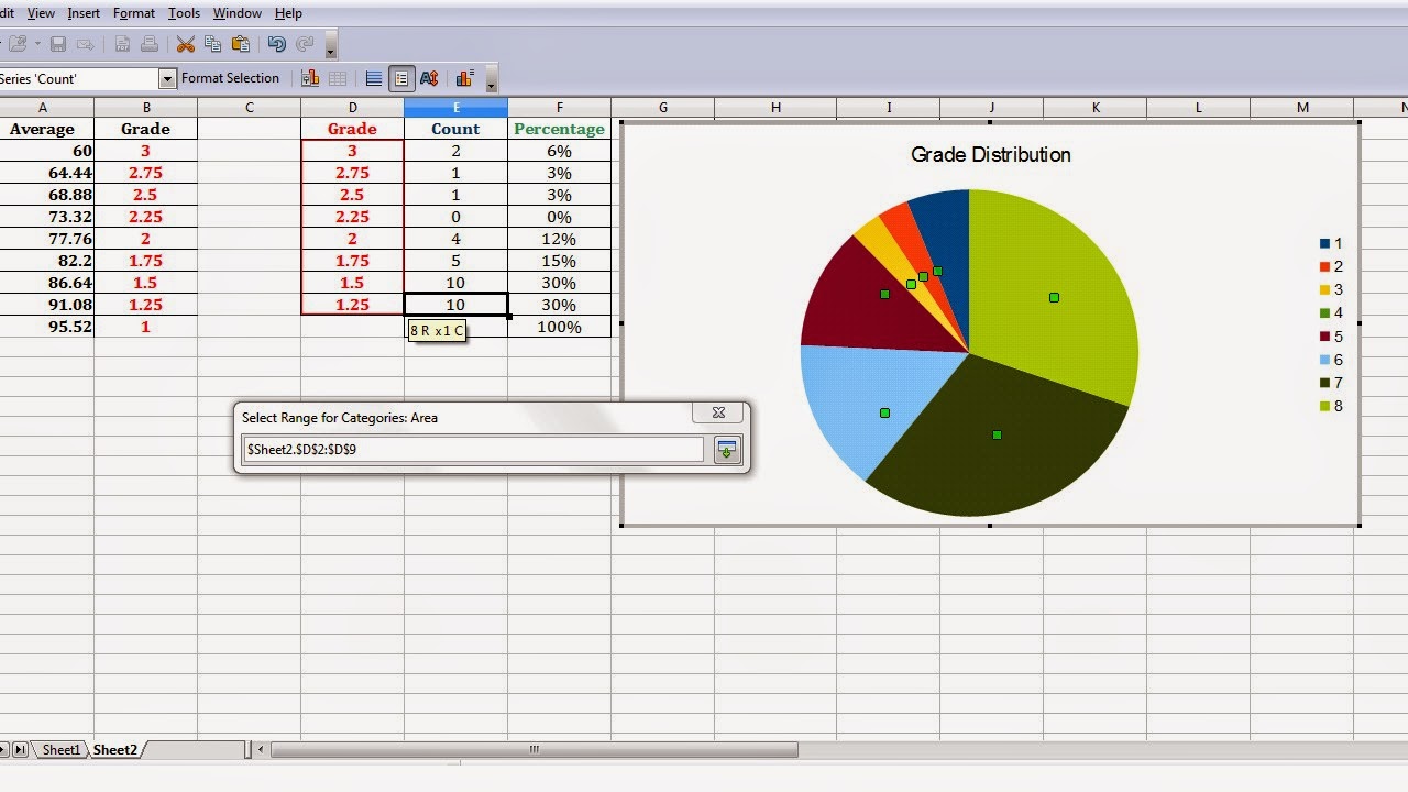
Step 5: By clicking OK, you'll have the grade distribution of your students with their corresponding percentages.


You can also change the colors of the pie if you want a better hue of colors.
Step 6: Double-click on the center of the pie, and another tab will appear. Choose colors you desire. Then click OK.

You now have a colorful Pie chart. ^_^
Thank you!
Please read my other tutorials! :)
All Rights Reserved (2014)
Intellectual Property of:
Josephine Joy V. Tolentino
Master of Science in Biology student
College of Arts and Sciences
Department of Biological Sciences
Central Luzon State University
Science City of Munoz, Nueva Ecija
Philippines
Here is an example of a data (from my Tutorial 2) where Grades, Count and Percentage of the grade distribution of students in Chemistry are shown.
Note: All of the students names and scores which appeared herewith are only hypothetical and do not reflect their real performance in class. This is for description and visual purposes only.
To create a bar chart:
Step 1: Highlight the cells where the data is located. This data will be used for the bar chart.
Step 2: Click the chart symbol on top.
Step 3: Another tab will appear (Chart Wizard) which asks you to choose a chart type. Since we are creating a bar chart (with vertical bars), choose column, then click next.
Step 4: Next, you are asked to choose the data range. But in here, we will focus more on Data Series, which is in Number 3.
Step 5: Click on the Data Series. You are to customize the data ranges for individual data series.
Step 6: You now have Data Series, namely Grade and Count. Since we are to create a bar chart based on how many of the students got a particular grade, the data series 'grade' will be omitted. Click grade, then click Remove.
Step 7: We now have the Count on our Data Series. To designate for categories, click the Categories portion, and highlight cells under Count.
Step 8: Then click the Y-Values. To designate for the Categories, highlight the cells under Grade. Then, click Next.
Step 9: Next, will be the Chart Elements. Enter your desired Title, Subtitles, Legend for the x and y axes. Click Finish.
Step 10: A bar chart will appear showing the grade distribution and number of student (count) of a particular grade.
In your bar chart, you can create your pie chart with it.
To transform a bar chart into a pie chart:
Step 1: Click on the center of the vertical bars until small green squares will appear.
Step 2: Right click, then click on Chart Type.
Step 3: Choose on Pie, then click OK.
Congratulations! You now have a pie chart showing the grade distribution of your students in Chemistry.
What if you want to have a pie chart showing the percentage of grades? You can just edit the previous pie chart which you have created.
Step 1: Click on the center of the pie until small, green squares will appear.
Step 4: To designate Categories of the Y-values, highlight cells under Grade.
Step 5: By clicking OK, you'll have the grade distribution of your students with their corresponding percentages.
You can also change the colors of the pie if you want a better hue of colors.
Step 6: Double-click on the center of the pie, and another tab will appear. Choose colors you desire. Then click OK.
You now have a colorful Pie chart. ^_^
Thank you!
Please read my other tutorials! :)
All Rights Reserved (2014)
Intellectual Property of:
Josephine Joy V. Tolentino
Master of Science in Biology student
College of Arts and Sciences
Department of Biological Sciences
Central Luzon State University
Science City of Munoz, Nueva Ecija
Philippines
No comments:
Post a Comment